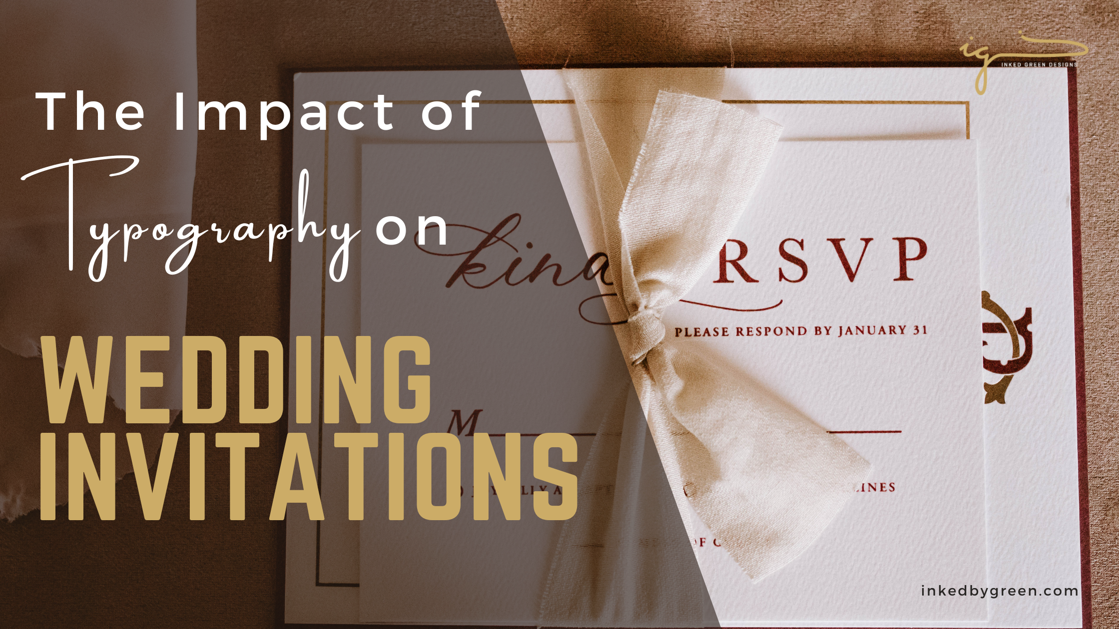
Typography, the art and technique of arranging type, plays a crucial role in shaping the style, mood, and overall impression of wedding invitations. From setting the tone for the event to conveying the personalities of the couple, typography is a powerful tool that can transform a simple piece of paper into a work of art. In this guide, we’ll explore the impact of typography on wedding invitations and how font choices can enhance the beauty and significance of this special keepsake.
1. Setting the Tone
Typography sets the tone for your wedding invitations, giving guests a preview of what to expect on your special day. Whether you’re planning a formal affair, a rustic celebration, or a modern soiree, the typeface you choose communicates the style and ambiance of your wedding. Serif fonts convey elegance and tradition, making them suitable for classic and formal weddings. Sans-serif fonts, on the other hand, are sleek and contemporary, perfect for modern and minimalist events. Script fonts exude romance and sophistication, while decorative fonts add whimsy and charm.
2. Reflecting Personalities
Font choices can also reflect the personalities and tastes of the couple. Are you classic and refined, or bold and adventurous? Do you prefer timeless elegance or modern simplicity? Your font selection can convey these traits and create a connection with your guests. Consider customizing your invitations with unique typography that reflects your individuality as a couple. Whether it’s a favorite script font that captures your love story or a quirky display font that showcases your sense of humor, let your personalities shine through in every letter.
3. Creating Visual Hierarchy
Typography helps create visual hierarchy within your wedding invitations, guiding the reader’s eye and highlighting essential information. Use a combination of font sizes, weights, and styles to differentiate between different elements of the invitation. For example, you might use a larger, bolder font for the names of the couple to make them stand out, while using a smaller, lighter font for the date and location details. By varying typography, you can draw attention to the most critical information while maintaining a harmonious and balanced design.
4. Enhancing Readability

While aesthetics are essential, readability should not be overlooked. Clear and legible typography ensures that your guests can easily understand the details of your wedding day. Avoid overly ornate or elaborate fonts that may sacrifice readability for style. Instead, opt for clean and straightforward typefaces that are easy to read, even at small sizes. Consider factors such as letter spacing, line height, and contrast to optimize readability and ensure that your invitations are both beautiful and functional.
5. Unifying Design Elements
Typography plays a crucial role in unifying various design elements within your wedding invitations, creating a cohesive and harmonious aesthetic. Choose fonts that complement other visual elements such as colors, illustrations, and motifs. Consistency in typography helps tie together different pieces of stationery. From save-the-dates to RSVP cards, creating a cohesive and memorable suite that tells a cohesive story. By selecting complementary fonts and maintaining consistency throughout your stationery, you can create a unified and visually striking invitation ensemble.
Conclusion: The Art of Typography
Typography is more than just arranging letters on a page; it’s an art form that can evoke emotions, convey meaning, and create lasting impressions. When it comes to wedding invitations, typography plays a vital role in setting the tone, reflecting personalities, guiding the reader, enhancing readability, and unifying design elements. By carefully selecting fonts that align with your vision and style as a couple, you can create invitations that are not only beautiful but also meaningful and memorable. So, embrace the art of typography and let your love story come to life in every letter.